I’m not a data viz expert. The charts in my last few posts (the RAG evaluation graphs in the Shiori post, the architecture diagram in the Hetzner + Cloudflare post) were made with AI tools. I described what I wanted, the model wrote the matplotlib or SVG, and I iterated. For a while, my first-pass charts looked exactly like what these tools tend to produce by default: vanilla matplotlib, default colors, a full bounding box, and a generic title. The useful discovery was that the output improves a lot when the prompt includes a few concrete chart-design constraints.
This post is the additions I use. It is not the optimal workflow. People who do this professionally have a sharper version of this loop. But if you’re starting from plain AI-assisted charts, this is a useful first pass.
Step 1 — Add the baseline instructions to the prompt
AI tools default to vanilla matplotlib styling: top and right axis spines drawn, default tab10 blue and orange, a tick-heavy y-axis, a generic title like “Traffic Flow: Northbound vs Southbound.” None of those are wrong. They just leave a lot of the reading work untouched. Four lines in the prompt do most of the work:
- Follow Alberto Cairo’s principles: truthful, functional, beautiful, insightful, enlightening. Even if the model only loosely remembers the framework, naming it changes the default output noticeably. Titles start stating claims instead of labeling axes. Subtitles start telling the reader what to look at.
- Remove chart junk: drop the top and right borders. Most matplotlib defaults draw a full bounding box. The eye doesn’t need it. Removing the top and right spines instantly makes the chart feel less like a textbook screenshot.
- Be mindful of data-ink ratio. Tufte’s idea: maximize the ink that conveys data, minimize the ink that doesn’t. In practice this means dropping redundant titles, killing the legend when lines can be labeled inline, and skipping heavy gridlines when axis ticks already give the reader anchor points.
- Don’t truncate the y-axis unless the claim depends on it. Bar charts especially: if the y-axis starts at 80 instead of 0, a 2× claim looks like a 5× one. This is scenario-dependent (a tight y-range is fine when the chart is about variation within a narrow band), but the default should be zero-based.
What this looks like in practice. Here is a vanilla “no prompt instructions” version of the freeway daily-traffic chart, and the version after the same chart was asked for with the four lines in the prompt:
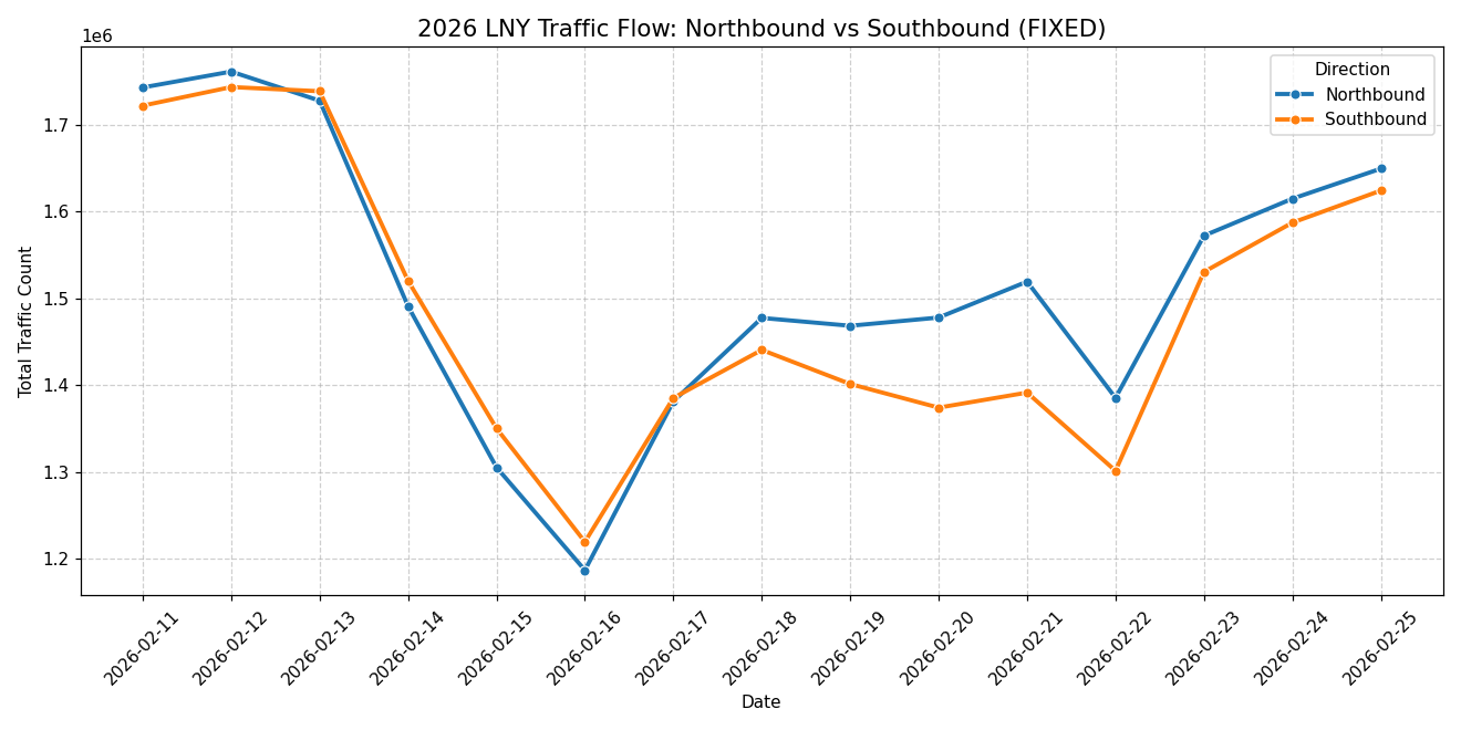
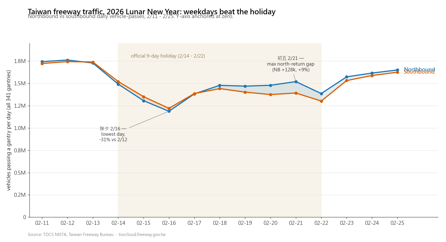
The data is identical. The chart type is identical. What changes is everything around the data. The holiday period is shaded, so the temporal context is visible instead of implied. The y-axis is anchored at zero, which keeps the holiday dip in faithful proportion to the baseline instead of turning a moderate drop into a dramatic-looking collapse. The legend is gone because the lines label themselves, and two annotations call out the actual extremes.
The same shift shows up on a heatmap. Vanilla first, then prompted:
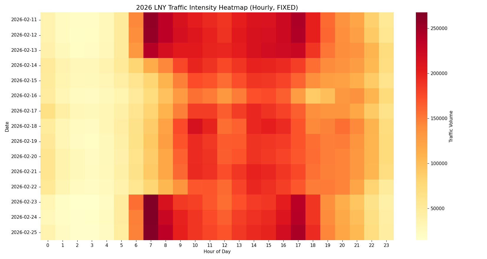
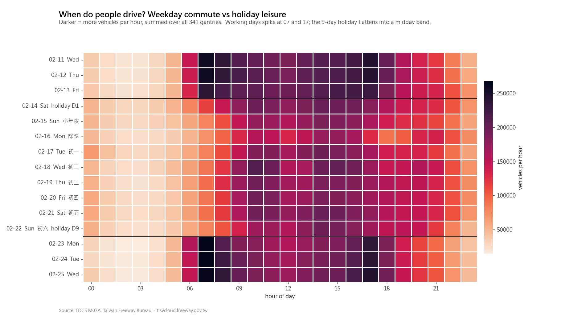
The chart type and the underlying numbers are unchanged. The reader’s experience is not. The holiday period is separated from the surrounding weekdays, and the palette changes from YlOrRd to rocket_r, which gives a more even perceptual ramp across the scale. The result is still a heatmap, but the color differences carry the traffic intensity more consistently.
These four lines do the heavy lifting. Most of the visible improvement in the rest of the post comes from this step. Everything below is refinement.
Step 2 — Brainstorm what the data could say, not how to chart it
With the baseline applied, the next trap I ran into was treating the first chart request as the start of the thinking. That made the exploration too narrow too early: pick a column, ask for a chart, then judge the result. The better loop is the other way around.
What works better is spending a few minutes with the data before deciding what to draw. I look for observations first: which signals are strongest, which are subtle, which comparisons change after aggregation, which outliers are real enough to explain. From there I usually pick more than one candidate idea and turn each one into a chart attempt. Some attempts survive, some turn into annotations, and some get dropped.
On the same freeway dataset I went through several iterations before landing on the migration-wave version I kept. An early attempt looked at the south-north migration as an hourly heatmap normalized against a same-hour weekday baseline:
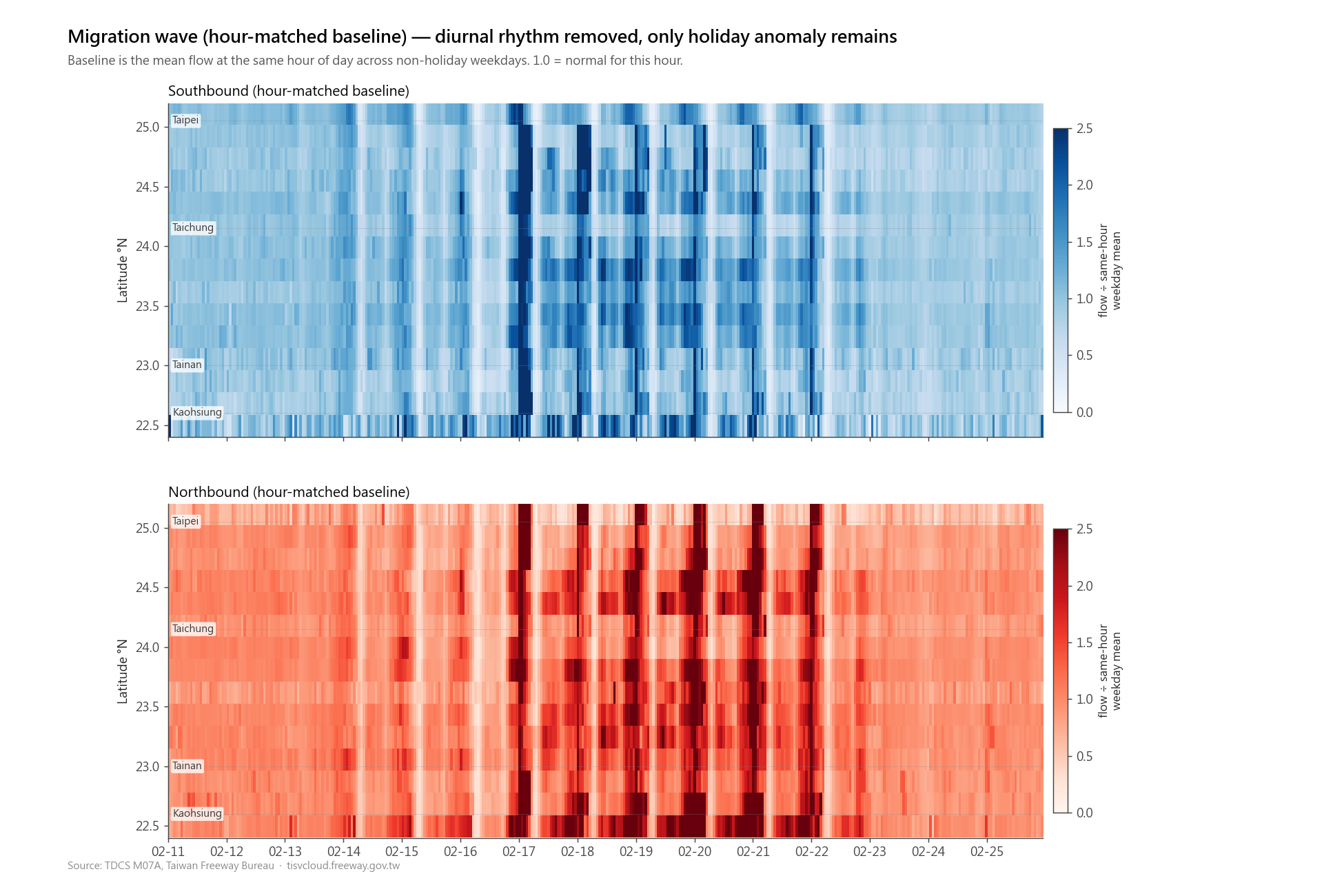
The signal is somewhere in there, but reading it requires the eye to integrate over hundreds of small cells and mentally divide by a baseline that isn’t drawn. After staring at it for a while, I went back to the brainstorm: the question I actually cared about is “did the migration wave roll south, then north.” That is a daily claim, not an hourly one. The aggregation level that fits is daily anomaly cells, with the largest deviations annotated in absolute vehicles:
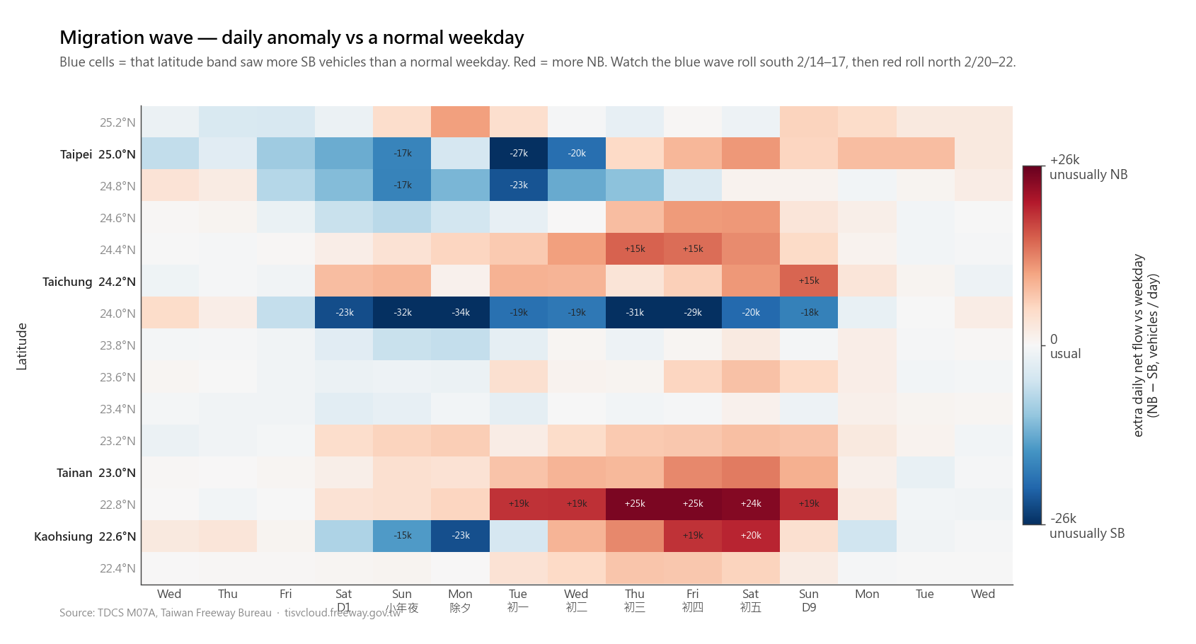
Same dataset, different observation, different chart. The brainstorm step is where the chart candidates come from. It is not a narrow “find the one claim” step; it is a way to keep the tool from locking onto the first obvious chart shape before the interesting parts of the data are visible.
Step 3 — Try a different chart form if the first one isn’t selling the claim
Sometimes the first form doesn’t sell the claim even with the baseline instructions applied. At that point, tweaking fonts and colors usually does less than trying two or three different forms of the same chart and picking the one that carries the claim most clearly.
On the same freeway dataset I had a claim I wanted to make: “雪隧 (the Hsuehshan Tunnel bottleneck) hits the same peak throughput on a weekday as on a holiday. What gets worse on the holiday is how long traffic sits at that peak.” The first chart was a line plot of 5-minute flow across three days:
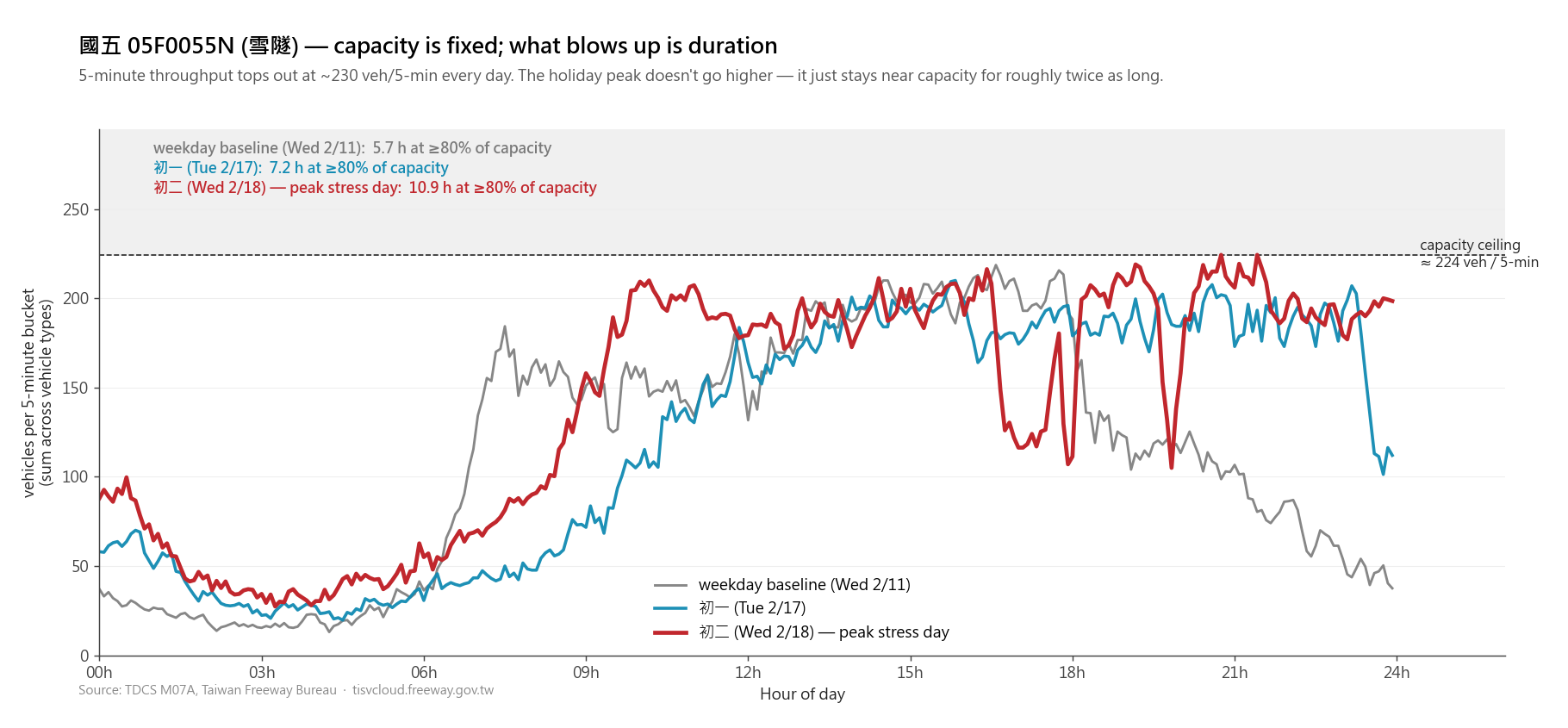
The data is correct. But the duration claim (the headline) is sitting in the subtitle as text, and confirming it means mentally tracing each line above the 80% capacity band and adding up the time it spends there. That turns a visual claim back into arithmetic, which is exactly the kind of mismatch the brainstorm step helps catch.
I asked for three alternative forms:
Three valid takes on the same claim. The bands version is the most direct read of duration (you can put a ruler on the red segment). The sorted-CDF is the cleanest “same peak, different shoulders” framing. The line-plus-bars version preserves the temporal axis (you can see when the plateau lengthens) while making the duration claim into a visible bar length.
I picked the third because the post needed both “where on the day does the stress live” and “how long does it last,” and that form carries both. The point isn’t which one is right. The point is the second pass: when the first chart isn’t selling its claim, it is often more useful to ask for two or three other forms than to keep sanding the edges.
Step 4 — Optional: a design-alignment pass against your design document
This step is newer for me. I tried it for the first time on the Shiori RAG post.
The default styling AI produces is “presentable chart on a white background.” That is fine as a stand-alone image. But on a dark editorial blog with warm amber and muted sage as accent colors, a white-background chart with default-blue and orange lines doesn’t read as part of the page. It looks like a paste-in from a notebook.
This blog has a design document describing its theme: dark warm background, warm amber as primary, muted sage as secondary, warm off-white (not pure white) for text, and a few chart-specific conventions like removing top and right axis spines. I added a final prompt step that hands that document to the chart-making context and asks the AI to match the palette and surface treatment.
The architecture diagram from the Hetzner + Cloudflare post is a clearer before/after than a single chart. This was the original light version:
And this is the version after the design-alignment pass:
Same diagram content, different visual context. Reading the post no longer means switching from the blog’s dark editorial surface to a white diagram pasted in from somewhere else.
This step only applies if you have a design system to align to. If you have one (a design document, a Figma file, a CSS variable list), it’s a small addition to the prompt that pays off on every visual from that point on. If you don’t, the result of step 2 already gets you most of the way.
What this is and isn’t
This is the prompt-side workflow I’ve been using for AI-assisted charts in my recent posts. It is not a push-button chart recipe. The model still gets details wrong, misses the point, over-decorates, or picks a chart form that needs to be replaced after looking at the result. The useful part of the prompt is that it moves the first draft closer to the kind of chart I want to critique.
Step 1 and step 2 are where most of the gain is: set the baseline instructions once, then put the actual cognitive work into exploring the data and choosing the observations worth charting. Step 3 is the loop you run when the first try doesn’t land. Step 4 is the polish that makes a chart fit its container.
I’m sure people who do data viz professionally would run a sharper version of this. But in my own workflow, the difference between giving the AI no prompt instructions and giving it these four is the difference between vanilla matplotlib and a chart a reader will actually look at twice. If you’re using AI to make charts for a post, a slide deck, or a report, that’s a small change that compounds across every chart you make.